6 Home Design Mistakes Rookie Interior Designers Often Make
Any house can definitely gain a styling advantage if the skill, talent, and expertise of experienced professional interior designers are put into play. With their keen eye and knowledge of the craft, these seasoned professionals can achieve the ultimate goal: to create a beautiful and comfortable space that can truly be called home.
Interior designers who are just starting out, however, may still feel overwhelmed by all the decisions that need to be made on the job. From picking the right furnishings to choosing color palettes and positioning décor for every room, making small decisions such as these tends to take up most of an interior designer’s time when it comes to setting up a personal space.
A slight error in judgment could lead to a ripple of interior design mishaps. Examples would be hanging artwork too high up a wall, or choosing the wrong paint finish for the house.
Young designers can take a cue from their more experienced counterparts. If you are still finding your feet in the interior design profession, here are six home design mistakes that new designers often make that you should keep in mind, along with the seasoned professionals’ methods for resolving them:

-
Using Furnishings and Décor in the Same Sizes
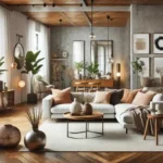
Proportion and scaling are crucial in interior design. If you buy furniture and décor that all come in the same heights and sizes, the visual effect they create in a room may not be as appealing as you initially imagined.
In some cases, people put too many small furnishings together in a room, thinking that it will make it look more spacious. However, the truth is that doing so only makes a space feel more cluttered. Alternatively, putting too many large items in a single room will only make it feel stuffed and tiny.
To achieve a balance between large and small items, think of the space like a cityscape. This will allow you to see the benefits of picking furniture and decor in varying sizes and, ultimately, design a room more like a pro would.
-
Using Dark Furniture in a Tight Space
Looking for the perfect pieces for a small house or apartment can be daunting. Not only are you likely to be faced with limited floor space, but you also need to make the room feel airy and comfortable.
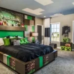
In this scenario, there’s one common mistake that interior design rookies tend to make: using dark-colored furniture. Most people choose bulky and dark furniture pieces to achieve contrast in a light-hued wall. While the intention may be good, doing so will only make the room feel cramped.
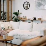
For a small apartment or house, it’s always best to choose pastel or other light finishes and fabrics to fill the space. Choose light-colored upholstery fabrics. Not only will this help in matching the furnishings with your chosen color palette, but it will also help keep the room looking bright and spacious.
-
Scattering Collection Pieces Around the House
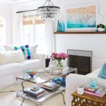
Every person has some sort of collection. These items can be used to add personality in interior design, and these can also save homeowners from making extra purchases on décor. However, most people tend to scatter pieces from their collection around the house in no particular order or pattern, making spaces appear messy.
Whether it’s a set of ceramic birds purchased during a trip abroad or a variety of coffee mugs you have gathered throughout the years, it’s always ideal to display your collection items together.
If you have a significant number of collectibles, arrange them in groups. While there is no hard-and-fast rule in doing so, you can try following the rule of three.
-
Setting Up Bad Lighting
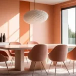
Another major rookie mistake in interior design is bad lighting. One specific example is using a single overhead light for the entire room.
While installing a massive overhead light at the center of a room may seem like a budget-friendly choice, it is considered a significant design faux pas. Not only does this make the space look like a hospital room, but it also fails to accentuate the décor and furnishings you put so much thought and effort into.
To avoid this, you should consider layering different kinds of lighting. Use recessed lights as general lighting, then add ambient lights in the form of pendant lighting and wall and floor lamps.
Meanwhile, spotlights can be used to highlight picture frames and artwork. You should also consider adding some task lights in the study or the kitchen.
-
Putting Furniture Against the Wall
If you like the way a sofa looks against some elegant home wallpaper, you probably would want to put the two as close together as possible. Still, it might be best to rethink this decision.
While the backside of furnishings manufactured in the past may not be designed to be displayed, newer pieces are now fully finished on all sides. This has paved the way for interior designers to highlight the beauty of sofas and beds by placing these in the center of the room.
You’d be surprised at how much a room’s design is improved when you change the layout of large-scale pieces of furniture. In fact, they are very useful in demarcating separate spaces, especially for studio-type homes and small apartments.
-
Using a Rug in the Wrong Size
In interior design, there’s no bigger blunder than picking a living room rug in the wrong size.
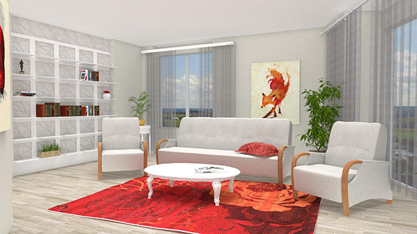
The entire purpose of placing a rug in the living room is to ground the entire seating space around it. It adds a welcoming vibe that makes guests and household members want to convene in the area.
When you choose the wrong rug, everything changes. Choose a rug that’s too small and you risk making the room feel disjointed; what’s more, it won’t be able to anchor the space. Choose one that’s too big, on the other hand, and it will swallow up the entire room.
Before you place furniture, you must first place a rug that is about 8 by 10 feet. Those measuring 9 by 12 feet are also good. The key is to pick a rug that is big enough to fit the legs of the sofa or two chairs on it.
Learning from the Experts
By watching how seasoned interior designers address these common mistakes, you will soon be developing your own design skills and honing a sharper sense for making a home truly aesthetically beautiful and functional.
AUTHOR BIO
James Prathap is the General Manager at NGC Nafees, top importers and exporters of wallpapers, flooring and fabric in the Middle East. Formed three decades ago, the business also offers high-quality panoramics, coordinated fabrics, and creative stickers for residential and commercial projects.

I am Scott Miller and my love is writing about home improvement. I write mostly about home ideas, but also share some tips and tricks that can make your life easier when it comes to getting things done in the house.

